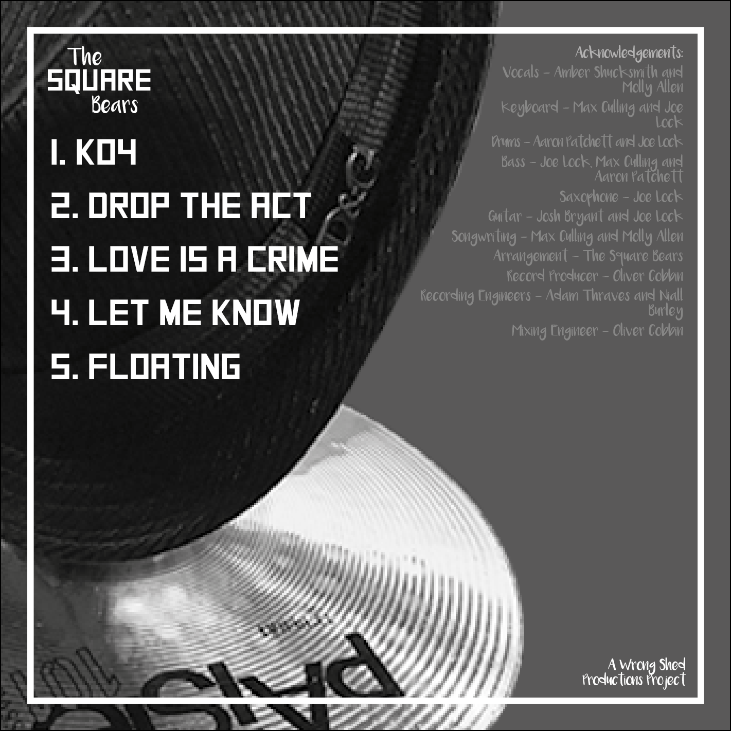
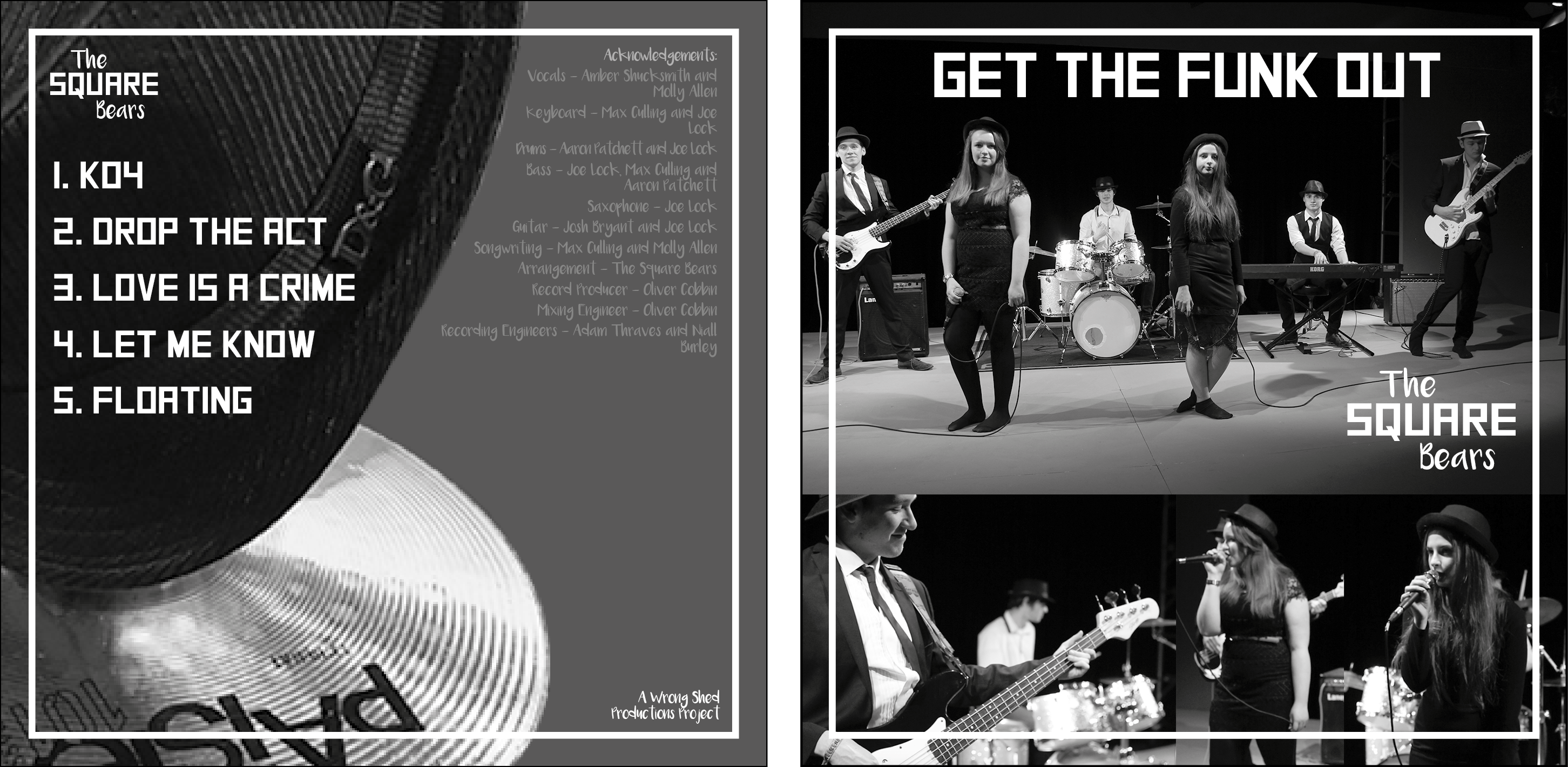
This is the album artwork, I have used a wide range of techniques to create this. First of all I began in photoshop where I took a collage of pictures from the music video and put them together, keeping them neat I used the same margins for the top of the pictures. I used two fonts, to keep consistency, the lead font is the square font and the secondary the handwritten font. As you can see I rebranded the logo, changing it from their current to an updated version using the two fonts. I researched into how big a CD cover was, so I knew the exact size to make these. As we are not printing and everything is going on soundcloud/Itunes, this will be for future use when The Square Bears decide to branch out even more. There are a list of acknowledgments on the back, this is standard for any CD cover, this lets people know who did what in the process. Also I used our company name ‘The Wrong Shed Productions’ in the bottom corner of the artwork, I did this as it builds a landmark image for our company, this is also something else recording companies/publishers undertake in order to let people know this was their project and where to get music like this in the future.
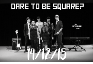
Below is the teaser artwork. This was released on Friday 11th December, a few days before the launch we did this because it is not too far away from the launch (14th December) and it lets people have a few days to get excited about it, too far away from the launch and this could slip from peoples minds. I went for the primary and secondary fonts again on this and also kept to the black and white theme. This was to build a brand identity for the square bears.